Spring wedding color palettes set the tone for the entire day, and in Boston, they feel even more special. The season brings soft light, fresh blooms, and a sense of new beginnings. Because of this, spring wedding color palettes should feel gentle, layered, and full of life.
But first, welcome. At Karli & Co., we believe a wedding weekend should feel calm, thoughtful, and well planned. As a Boston wedding planner, we guide each step with care so every moment flows with ease. If you’re planning a Boston wedding, we invite you to explore our portfolio, learn about our services, or connect with us to get started.
The Romance of Spring in Boston
Spring in Boston feels like a quiet love story. The city wakes up after a long winter. Trees bloom along cobblestone streets. Gardens begin to open, and the air feels light again.
This shift creates a natural sense of romance. It invites couples to lean into soft textures and thoughtful color choices. From historic venues to waterfront views, Boston offers a beautiful mix of old and new. Your palette should reflect that balance.
Planning a full wedding weekend in Boston comes with many moving parts. To see how expert guidance can bring it all together with ease, we invite you to read our blog, Why Hiring a Boston Wedding Planner Is the Key to a Seamless Wedding Weekend.
Why Spring Weddings in Boston Need a Well-Planned Color Story
In spring, color is everywhere. Flowers bloom in soft pastels. The sky shifts from grey to pale blue. Even the light feels warmer.
Because of this, your color palette should not feel forced. Instead, it should blend with the season. A thoughtful palette ties together your florals, linens, paper goods, and attire. It creates a full experience for your guests. When done well, it feels effortless. Each detail supports the next. Nothing feels out of place.
Spring Wedding Color Palettes with Soft Neutrals and Layered Whites
Soft neutrals are always timeless, and in Boston, they feel especially elegant in spring.
- Think ivory, cream, and soft beige for a gentle, refined base
- Layer in texture with linen tablecloths, delicate florals, and candlelight for added depth
- This palette works beautifully in historic venues and allows the architecture to shine
- It also creates a calm and polished atmosphere for your guests
- To keep the look from feeling flat, mix tones like warm whites with cooler shades
- Add soft greenery for a fresh, natural touch
Together, these elements create a look that feels soft, layered, and effortlessly refined.
Planning a private estate wedding comes with unique details. Learn how full-service planning brings ease and clarity in our blog, The Benefits of Full-Service Wedding Planning for Private Estate Weddings.
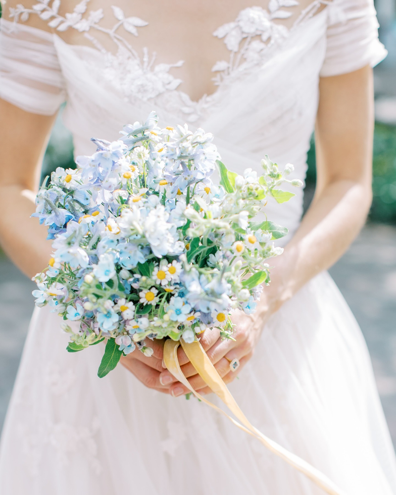
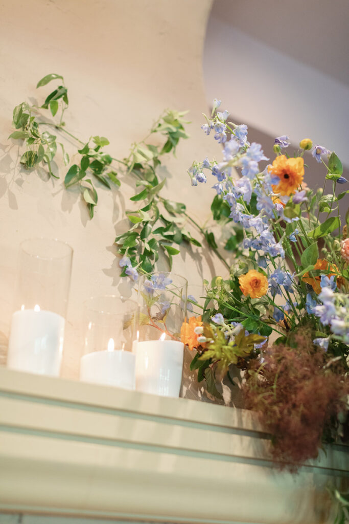
Dusty Blue, Sage, and Garden-Inspired Greens
This palette feels like a walk through a spring garden. It is fresh, calm, and easy to love. Dusty blue brings softness. Sage adds a natural feel. Together, they create a quiet harmony.
This combination works well in both indoor and outdoor settings. It pairs beautifully with loose floral designs. It also complements Boston’s waterfront spaces. For added depth, include small touches of white or soft grey. This keeps the palette light while still feeling complete.
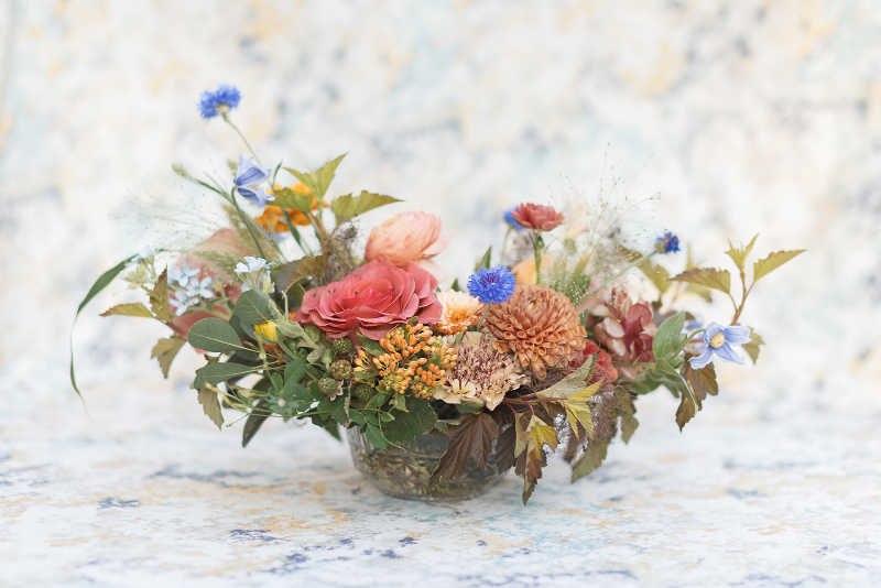
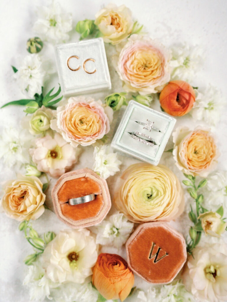
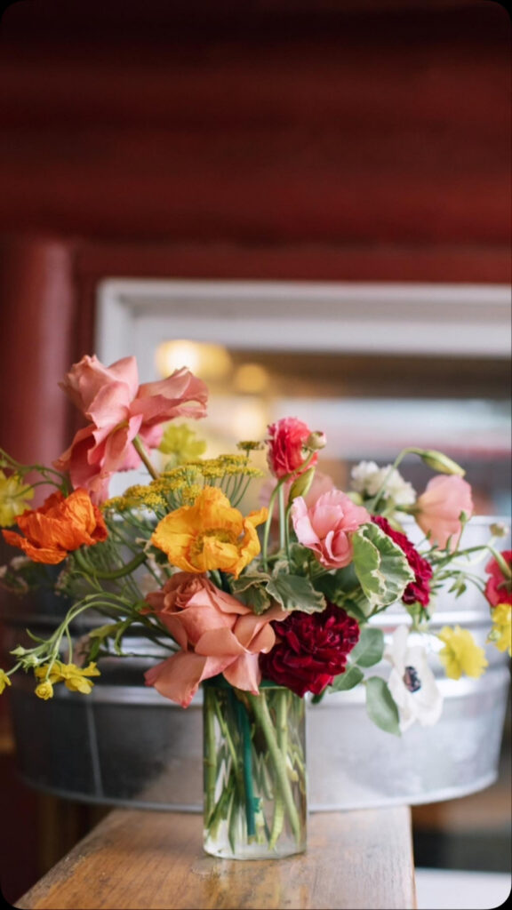
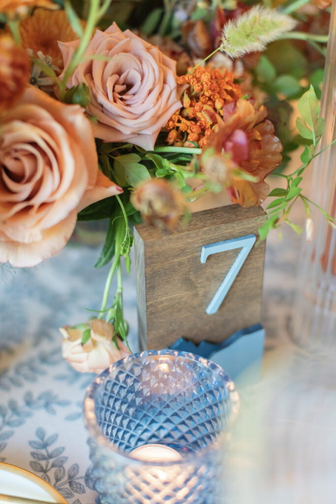
Spring Wedding Color Palettes with Blush, Apricot, and Warm Tones
For a softer take on color, blush and apricot are lovely choices. These tones feel warm without feeling too bold.
- Blush adds a soft sense of romance to the overall design
- Apricot brings a gentle glow that feels warm and inviting
- Together, they create a palette that feels joyful and full of light
- This combination works beautifully in garden settings or tented receptions
- It also pairs well with gold accents for a subtle touch of warmth
- To keep the look balanced, add cream or soft taupe tones
Together, this palette feels warm, welcoming, and softly refined without feeling overpowering.
Reception design is evolving in beautiful ways. See how elevated floral and drapery details can transform your space in our blog, How Overhead Floral and Drapery Installations Are Redefining Reception Design.
Lavender, Lilac, and Soft Grey
Lavender and lilac bring a quiet elegance to spring wedding color palettes. They feel soft but still have presence. When paired with soft grey, the palette becomes more refined. The grey tones down the sweetness and adds balance.
This combination works well in classic Boston venues. It also photographs beautifully in spring light. For florals, choose blooms with natural movement. This keeps the look fresh and not too styled.
Coastal Blues with Sand and Driftwood Neutrals
Boston’s coastal charm offers a unique source of inspiration, drawing from the tones of the sea and shore.
- Soft blues reflect the water and bring a calm, airy feel
- Sand tones add warmth and balance to the palette
- Driftwood hues introduce natural texture and depth
- This palette works especially well for waterfront venues
- To keep the design polished, use clean lines and simple details
- Avoid over-layering so the colors can stand out
When thoughtfully styled, this palette feels effortless, refined, and deeply connected to Boston’s coastal setting.
Your guests deserve an experience that feels thoughtful from start to finish. Read our blog, 5 Ways We Elevate the Wedding Guest Experience at Every Colorado and New England Celebration, for more insight.
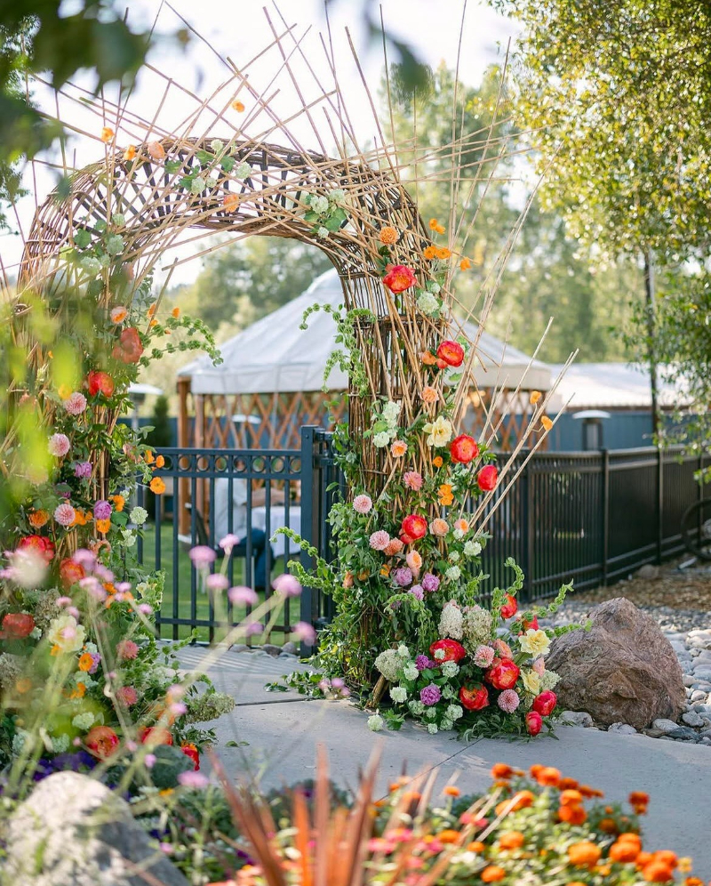
Unexpected Spring Pairings for a Modern Boston Wedding
Some couples want something a bit different. Spring still allows for creativity. Try pairing soft peach with muted olive. Or mix pale yellow with charcoal. These combinations feel fresh and modern.
The key is balance. Keep one color soft and let the other add contrast. This creates interest without feeling too bold. Unexpected pairings work best when the rest of the design stays simple. This allows the colors to stand out in a thoughtful way.
How to Choose the Right Spring Color Palette for Your Boston Venue
Your venue should guide your choices, as it sets the tone for the entire celebration.
- Start by looking at the space and noticing the colors already present
- Pay close attention to the natural light and how it shifts throughout the day
- Historic venues often call for softer palettes that support their existing details
- Waterfront spaces feel best with light blues and soft neutrals that reflect the setting
- Ballrooms can hold more color, but it’s important to keep the palette balanced
- Think about the timing within spring, as early spring feels cooler and late spring feels warmer
- Let the season help guide the tones you choose
When each element works together, from florals to linens to attire, the overall design feels seamless and thoughtfully complete.
Multi-day weddings create space for deeper connection and meaningful moments. Learn how to plan one with ease in our blog, The Rise of Multi-Day Wedding Experiences (and How to Curate One Seamlessly).
A Thoughtful Approach to Spring Wedding Color Palettes
Spring wedding color palettes in Boston are about more than color alone. They tell a story and reflect the season, the setting, and the couple. When chosen with care, they create a sense of ease. Guests feel it the moment they arrive. The space feels welcoming and complete.
If you are beginning to explore your own palette, we would love to guide you. Our team approaches each design with intention and care. You can inquire about a consultation to begin your planning journey. For more inspiration and behind-the-scenes moments, follow along on Instagram.